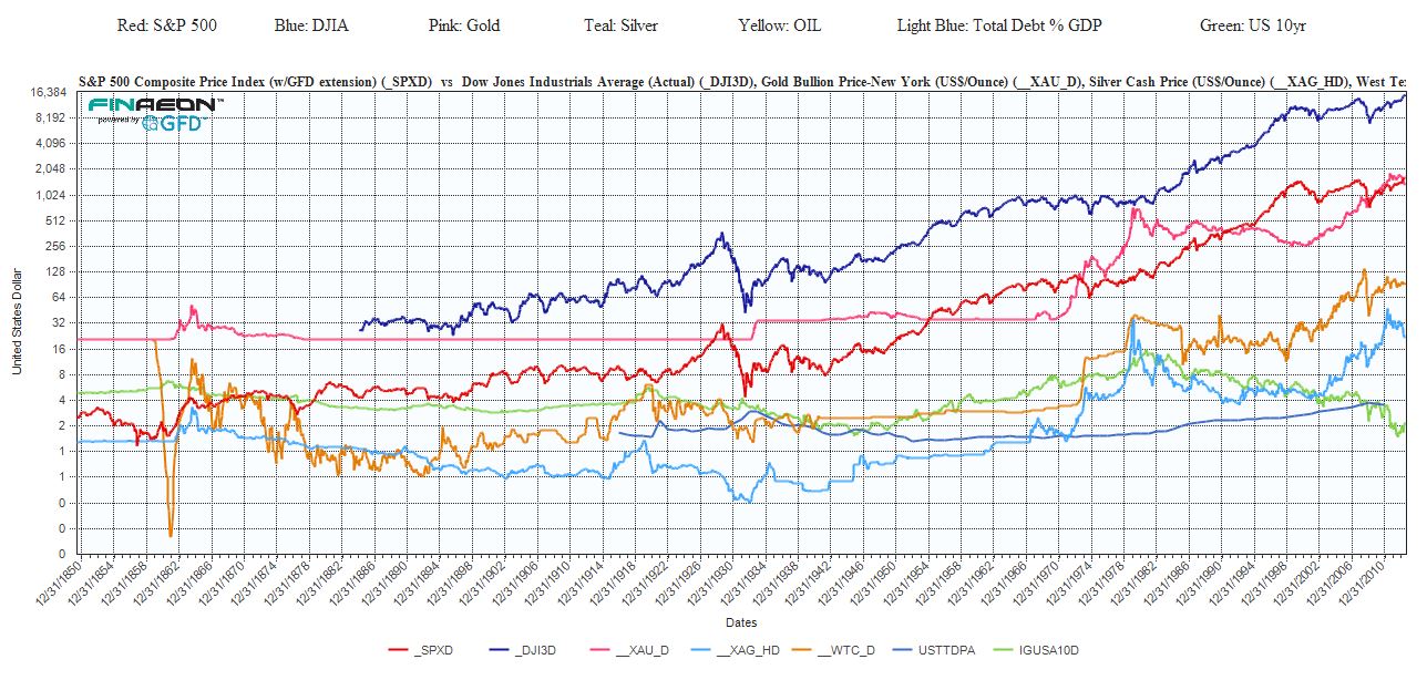
Ralph Dillon of Global Financial Data put together this very long term chart that shows how stocks (S&P 500 and DJIA), commodities (Gold, Silver, and West Texas Intermediate crude oil), bonds (US 10yr) and the US national debt (Total Debt as a % of GDP) have risen over time – from 1850. Click to enlarge:
Dillon comments:
What surprised me in doing so was that they are all at or very close to all time highs with the exception of the US 10yr Yield which of course just bounced off an all time low. Ironically, had we used price instead of yield, that too would be at all time high.
What fascinated me about this is that we hear about what each are doing daily, but rarely look at them all together. In doing so, it’s amazing that for as much problems that we appear to have politically, economically and socially, the markets appear unfazed in any way. Resilient. Or are they?